Using Color for a More Accessible Website

The use of colors in a website is more than an aesthetic choice. Developers must have a strong knowledge of having users interact with browsers. They also have to be careful about the presentation of web elements.
People with different abilities like Color Blind individuals rely on accessibility mode on websites. Developers also need to keep the accessibility needs in mind.
If you are a developer who needs to follow the guidelines mentioned above while following proven color usage guidelines, you are at the right place. Keep reading to find out how to choose the best colors to boost accessibility of your website.
Check Your Website’s Color Contrast Ratio
The first step in achieving color contrast awareness is to know your website’s current contrast ratio. The color contrast ratio measures the colors you use for your text and background and how bright or dark they appear when used together. You may use a color contrast checker to automate the process of measuring this ratio.
Here are two standards to follow:
- 4.5:1 for normal-sized text
- 3:1 for large text
Keeping the color contrast ratio higher will make your text more visible and readable.
Use Complementary Colors
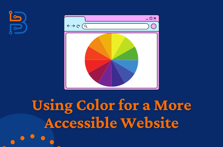
One way of achieving color contrast is using complementary colors, or colors that are opposite each other. Typical complementary color combinations include black and white or blue and orange. Using this type of color combination results in a visually appealing website with a high degree of readability.
Use Color to Create Visual Hierarchy
You may incorporate color into your website’s visual hierarchy. The term “visual hierarchy” refers to the variation of website elements’ attributes, such as color and size, that expresses their importance as part of the text content. In other words, you can change up text elements to emphasize the more important parts. The most common type of visual hierarchy consists of headings and subheadings, where the largest text size is often reserved for web page titles, the next size for section titles, and so on. You may also use brighter colors for titles and text that you want to emphasize and fainter shades for text that you don’t intend to draw attention to. This type of variation allows the reader to skip the less important parts and go straight to the real meat of the content.

Use Colorblind Friendly Themes
Color blindness is one of the most widespread visual impairments, affecting 8% of males and 0.5% of females globally. Individuals with this disability encounter challenges with reading text set in certain color combinations, the most common being green and red. This means you will need to avoid these combinations if you wish to make your website accessible to users with color blindness. Your website platform will most likely have themes that are friendly to colorblind users that are easy to use. You may also use a color contrast checker tool to find combinations that result in better readability while complying with your organization’s branding guidelines.
Do Not Rely On Color Alone
Relying on color alone isn’t the best you can do as a developer. The recommendations given in the following paragraph might seem contradictory, but they are important to understand. There’s no denying that choosing the right color can help you convey your message. But you can’t rely on color alone to communicate the message with all people in your target audience.
Read Also: Mastering Typography in Web Design
You need to use other visual cues to make specific blocks of text stand out. For example, you can underline hyperlinks in addition to using a different color. You may also use symbols such as start and stop signs or checks and cross marks to emphasize do’s and don’ts instead of just using green and red text, respectively.
Make an Accessible Color Palette
Start by having a specific color in mind you will be using throughout your website. This can be your brand color or anything you will like on your website. Take the HEX code of this color and generate other colors from it. This way, you will get different color palettes that match your brand color. You can then use this color palette to design your website. A color palette based on one color will make the design stand out and result in an easy-to-use website interface.

Test Saturation with Grayscale
Using grayscale is a great way to check the accessibility of two colors. You don’t need to go through a lot of processes to perform the accessibility check. Start by putting the two colors on grayscale and then reduce their saturation. Checking the contrast on the screen will allow you to compare saturation easily. But the colors won’t be accessible if the two colors meld.
Update Inaccessible Color Combinations
To make the two inaccessible colors accessible, you will have to put both of these colors to a testing tool. After this, toggle between the colors to come up with a more accessible color combination you can use for your website.
This process will produce a combination of colors. In an ideal case, the new color combination will pass the accessibility test. Make sure you check color combinations to ensure your website follows the accessibility standards.
Whatever you do, just be sure to ensure a proper contract between the background and the colors in the text. This combination is more accessible because it reduces the eye strain and lets users easily interact with your content. This type of contrast will also help users with low vision to skim through your webpage. All in all, it is important to keep the right contrast and accessibility in mind in order to catch visitors’ attention and make them stay on your website.
Website Accessibility Through Color
The use of color in your website is not just an aesthetic choice; it is also intertwined with the needs of users with disabilities. By using a color contrast checker to discover your website’s existing color contrast ratio, you can start creating a strategy to use color to increase readability, emphasize content hierarchies, and enhance the overall user experience. This exercise offers an excellent opportunity to ensure that your website is more accessible and inclusive.


